Follow Me!
CSS Combinators (>,~,+)… sound powerful, and they are. Really, I should be out running in this gorgeous January weather, instead I’m playing with combinator combinations… lots of fun (I know, …pathetic). Color saturated nth-child pseudo-selectors next. Getting really excited about that tho…!
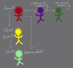
Here is a very simple visual of some child/descendant/sibling relationships and which combinator to use with each – and some animated triangles:

Child: #alizarin-crimson > #bismuth-yellow
Descendant: #alizarin-crimson #cobalt-green (white space as selector)
Adjacent Sibling: #alizarin-crimson + #dioxazine-purple
General Sibling: #alizarin-crimson ~ #emerald
A little animation using Adjacent Sibling Combinator (#tri-left + #tri-right). Pass your mouse over the first triangle. Probably won’t work for older versions of IE…sorry!
HTML
<div id="boxspace">
<div id="tri-left"></div>
<div id="tri-right"></div>
</div>
CSS
#tri-left {
        width: 0;
        height: 0;
        border-top: 50px solid transparent;
        border-right: 100px solid #FF0000;
        border-bottom: 50px solid transparent;
        position:absolute;
}
#tri-right {
        -webkit-transition-delay:initial;
        -webkit-transition-duration:1s;
        -webkit-transition-property:all;
        -webkit-transition-timing-function:ease-in-out;
        width: 0;
        height: 0;
        border-top: 50px solid transparent;
        border-left: 100px solid #FFFF00;
        border-bottom: 50px solid transparent;
        position:absolute;
        left:120px;
}
#tri-left:hover + #tri-right {
        -webkit-transform: rotate(360deg);
        -moz-transform: rotate(360deg);
        -o-transform: rotate(360deg);
        -ms-transform: rotate(360deg);
        left: 640px;
        width: 0;
        height: 0;
        border-top: 50px solid transparent;
        border-left: 100px solid #FF7518;
        border-bottom: 50px solid transparent;
}
Please Share!
